
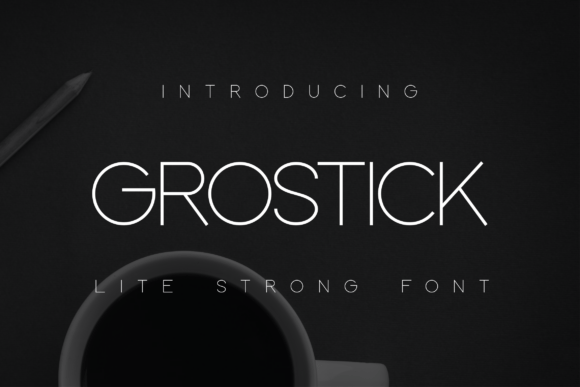
Grostick Font: Elevate Your Design with Modern Simplicity and Urban Charisma
In the realm of typography, the right font can significantly impact the effectiveness of a design. Whether you’re crafting a brand identity, designing a website, or working on an editorial layout, the choice of font is crucial in conveying your message with clarity and conviction. This is where Grostick comes into play—a geometrically crafted sans serif font that embodies modern simplicity with a robust urban charm.
Introducing Grostick: A Geometric Sans Serif Font
Grostick is not just any font; it’s an elegantly designed typeface that strikes a perfect balance between modern simplicity and urban charisma. Its geometric structure, combined with smooth curves and sharp edges, gives it a unique appeal that can elevate any design project. The font’s design is centered around the concept of achieving a striking equilibrium of proportions, making it versatile for various applications.
📸 Preview Images


💡 Click on any image to view full size
Design Characteristics of Grostick
Grostick’s design is characterized by its minimalist approach, smooth curves, and razor-sharp edges. These characteristics make it an ideal choice for designers looking to add a touch of modernity and sophistication to their work. The font’s geometric structure ensures that it remains legible across different platforms and sizes, making it perfect for both digital and print applications.
- Geometric Structure: Grostick’s geometric design ensures a harmonious and balanced look, suitable for a wide range of design projects.
- Smooth Curves and Sharp Edges: The combination of smooth curves and sharp edges gives Grostick its distinctive look, adding elegance and dynamism to any text.
- Minimalist Approach: Grostick’s minimalist design amplifies the impact of your message, ensuring it stands out with clarity and conviction.
The Versatility of Grostick: Diverse Applications
Grostick’s versatility is one of its most compelling features. Its design makes it suitable for a wide range of applications, from branding and logos to web design and editorial layouts. The font’s ability to convey a sense of sleek professionalism and effortless style makes it a valuable asset for designers working across different mediums.
Iconic Branding and Logos
Grostick’s modern and sophisticated look makes it an excellent choice for crafting iconic branding and logos. Its unique design ensures that your brand stands out, conveying a sense of innovation and forward-thinking.
Interactive Web Designs
In the digital realm, Grostick shines in interactive web designs. Its legibility and aesthetic appeal make it perfect for website headers, navigation menus, and other interactive elements, enhancing the user experience.
Advanced Tech Interfaces
Grostick’s geometric and modern design makes it well-suited for advanced tech interfaces. Whether it’s for an app, software, or a digital platform, Grostick brings a level of sophistication and professionalism that aligns with tech’s innovative nature.
Sophisticated Editorial Layouts
In print, Grostick proves to be a versatile font for editorial layouts. Its clarity and elegance make it ideal for magazine articles, book titles, and any other editorial content where readability and style are paramount.
The Benefits of Using Grostick
The benefits of using Grostick in your design projects are numerous. From its aesthetic appeal to its functional versatility, Grostick offers a range of advantages that make it a preferred choice among designers.
- Enhanced Readability: Grostick’s clear and geometric design ensures high readability across various platforms and sizes.
- Modern Aesthetic: The font’s modern simplicity and urban charisma add a contemporary touch to any design.
- Versatility: Grostick’s adaptability makes it suitable for a wide range of applications, from digital interfaces to print materials.
- Professionalism: The font imbues designs with a sense of sleek professionalism and effortless style.
Tips for Effectively Using Grostick
To maximize the impact of Grostick in your designs, consider the following tips:
Pairing with Other Fonts
While Grostick is versatile on its own, pairing it with complementary fonts can enhance its appeal. Opt for fonts that complement its geometric and modern characteristics.
Choosing the Right Size
Ensure that Grostick is used at an appropriate size for its intended application. Its design ensures legibility at various sizes, but selecting the right size is crucial for maximizing impact.
Color Selection
The color scheme you choose for Grostick can significantly affect its appearance. Select colors that align with your brand’s identity and the overall design aesthetic.
Grostick Font: Access Download Now
| Font Name | Grostick Font |
| Author | Unknown |
| Download | Access Download Here |
Conclusion
Grostick is more than just a font; it’s a design statement. Its geometric sans serif structure, combined with modern simplicity and urban charisma, makes it a powerful tool for designers. Whether you’re working on branding, web design, tech interfaces, or editorial layouts, Grostick offers a blend of elegance, versatility, and professionalism that can elevate your designs to new heights. Embrace Grostick in your next project and experience the difference it can make.
