
Boston 1851 Font: A Timeless Classic with Enduring Legibility
The Boston 1851 font is a testament to the rich history of typography in the United States. This classic font, with its unique blend of strength and elegance, has been a favorite among printers and designers for centuries. In this article, we’ll explore the origins of the Boston 1851 font, its distinctive characteristics, and why it remains a popular choice for designers and typographers today.
The Origins of Boston 1851 Font
The Boston 1851 font is based on a stereotype used by Wier and White, Printers of Boston, which was created by the New England Stereotype Foundry under the auspices of Hobart and Robbins, also of Boston. This historic font was designed to meet the needs of printers in the mid-19th century, who required a typeface that was both legible and aesthetically pleasing.
📸 Preview Images


💡 Click on any image to view full size
The New England Stereotype Foundry was a prominent type foundry in Boston during the 19th century, and Hobart and Robbins were well-respected printers and typographers. The collaboration between these two entities resulted in the creation of the Boston 1851 font, which would go on to become a staple of American typography.

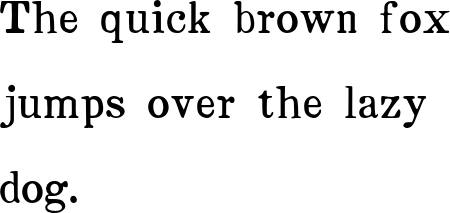
An example of the Boston 1851 font in use.
Distinctive Characteristics of Boston 1851 Font
The Boston 1851 font is characterized by its unique blend of strength and elegance. It has a nice strength combined with a fullness that lends to good legibility, especially in smaller sizes. This makes it an ideal choice for body text, where readability is paramount.
The font’s x-height is moderate, with a subtle contrast between the thick and thin strokes. The letterforms are well-proportioned, with a clear and consistent design that makes it easy to read. The Boston 1851 font also features a distinctive italic version, which has a wonderful movement to it and is extremely legible in fine print.
The Italic Version of Boston 1851 Font
The italic version of the Boston 1851 font is a standout feature of this typeface. With its fluid, cursive lines and dynamic movement, it adds a touch of elegance and sophistication to any design. The italic version is also extremely legible in fine print, making it an excellent choice for use in lengthy texts or articles.
The italic version of the Boston 1851 font is also notable for its subtle slant, which adds a sense of energy and movement to the text. This makes it an excellent choice for use in headings, subheadings, and other display text, where a touch of flair is desired.
| Font | X-Height | Stroke Contrast | Legibility |
|---|---|---|---|
| Boston 1851 | Moderate | Subtle | Excellent |
A comparison of the Boston 1851 font’s characteristics.
Why Boston 1851 Font Remains Popular Today
Despite being created over 150 years ago, the Boston 1851 font remains a popular choice among designers and typographers today. So, what’s behind its enduring appeal?
One reason is its timeless elegance. The Boston 1851 font has a classic, sophisticated look that never goes out of style. It’s a versatile typeface that can be used in a wide range of applications, from traditional printing to digital media.
Another reason is its exceptional legibility. The Boston 1851 font is designed to be easy to read, even in small sizes. This makes it an excellent choice for body text, where readability is paramount.
Boston 1851 Font: Access Download Now
| Font Name | Boston 1851 Font |
| Author | Unknown |
| Download | Access Download Here |
Conclusion
The Boston 1851 font is a true classic of American typography. With its unique blend of strength and elegance, it’s a typeface that has stood the test of time. Its exceptional legibility, versatile design, and timeless elegance make it an excellent choice for designers and typographers looking for a reliable and sophisticated typeface.
Whether you’re working on a traditional printing project or a digital design, the Boston 1851 font is definitely worth considering. Its rich history, distinctive characteristics, and enduring appeal make it a typeface that will continue to be a popular choice for generations to come.
Font Specimens:
The quick brown fox jumps over the lazy dog.
The quick brown fox jumps over the lazy dog.
The quick brown fox jumps over the lazy dog.
