
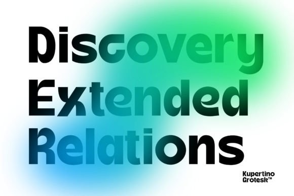
Kupertino Grotesk Font: A Modern Sans Serif for Clarity and Impact
In the realm of typography, the right font can elevate a design project from good to exceptional. With the introduction of Kupertino Grotesk, a modern sans serif font, designers now have a versatile tool at their disposal. This font is specifically designed for clarity and impact, making it suitable for a wide range of projects. In this article, we’ll delve into the features, benefits, and applications of Kupertino Grotesk, exploring why it’s becoming a go-to choice for designers worldwide.
Introducing Kupertino Grotesk
Kupertino Grotesk is a contemporary sans serif font that stands out for its clean lines, straightforward design, and exceptional legibility. The font comes in two distinct styles: regular and oblique. This dual offering provides designers with flexibility, allowing them to choose the style that best suits their project’s needs. Whether you’re working on a website, a marketing campaign, or a print project, Kupertino Grotesk’s versatility and aesthetic appeal make it an excellent choice.
Key Features of Kupertino Grotesk
- Modern Sans Serif Design: Kupertino Grotesk boasts a modern sans serif design that ensures clarity and readability across various mediums.
- Two Distinct Styles: The font is available in two styles—regular and oblique—offering designers more creative options.
- High Legibility: Designed with legibility in mind, Kupertino Grotesk is perfect for both digital and print applications.
- Versatile: Suitable for a wide range of design projects, from websites and apps to marketing materials and publications.
The Design Philosophy Behind Kupertino Grotesk
The design of Kupertino Grotesk is rooted in a philosophy that prioritizes clarity, simplicity, and impact. The creators aimed to develop a font that would be highly legible, versatile, and capable of making a statement. By focusing on clean lines and a straightforward design, Kupertino Grotesk achieves a balance between form and function. This balance is crucial in typography, as it ensures that the font not only looks good but also communicates effectively.
Benefits of Using Kupertino Grotesk
- Enhanced Readability: Its modern design and clear letterforms make it easy to read, even at smaller sizes.
- Improved Aesthetic Appeal: The font’s sleek and contemporary look can elevate the visual appeal of any design project.
- Flexibility: With two styles to choose from, designers can adapt Kupertino Grotesk to various contexts and layouts.
- Professionalism: The use of a well-designed font like Kupertino Grotesk can convey professionalism and attention to detail.
Applications of Kupertino Grotesk
Kupertino Grotesk’s versatility makes it suitable for a myriad of applications. Here are some of the areas where this font can make a significant impact:
Digital Applications
- Websites: Use Kupertino Grotesk for headings, body text, or UI elements to create a cohesive and professional look.
- Mobile Apps: The font’s legibility on screens makes it an excellent choice for mobile app design.
- Digital Marketing: Enhance your digital marketing materials, such as email newsletters and social media graphics, with Kupertino Grotesk’s modern appeal.
Print Applications
- Brochures and Flyers: Add a professional touch to your print materials with Kupertino Grotesk’s clean and contemporary design.
- Posters: The font’s impact and legibility make it suitable for posters and large-format prints.
- Publications: Use Kupertino Grotesk in magazines, newspapers, and books for a modern and readable typeface.
How to Use Kupertino Grotesk Effectively
To maximize the potential of Kupertino Grotesk, consider the following tips:
Tips for Effective Use
- Mix and Match: Combine the regular and oblique styles to create visual hierarchy and interest.
- Consider Context: Choose the appropriate style based on the project’s context and the message you want to convey.
- Pay Attention to Size: While Kupertino Grotesk is legible at various sizes, ensure that it’s large enough to be easily readable, especially in digital applications.
- Experiment with Colors: The font’s versatility extends to color schemes; experiment with different colors to find the best match for your design.
Kupertino Grotesk Font: Access Download Now
| Font Name | Kupertino Grotesk Font |
| Author | Unknown |
| Download | Access Download Here |
Conclusion
Kupertino Grotesk is a powerful addition to the world of typography, offering designers a modern sans serif font that excels in clarity and impact. With its two distinct styles, high legibility, and versatile design, Kupertino Grotesk is poised to become a favorite among designers. Whether you’re working on digital projects, print materials, or anything in between, this font provides the tools you need to create visually appealing and effective designs. Embrace the possibilities with Kupertino Grotesk and elevate your design projects to new heights.
