
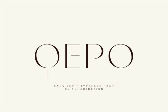
Qepo Font: The Epitome of Modern Elegance in Typography
In the realm of typography, the quest for the perfect font is a perpetual journey. Designers and brands alike are constantly on the lookout for typefaces that not only convey their message with clarity but also add an aesthetic value to their creations. It is in this pursuit of excellence that the “QEPO” font emerges as a beacon of modern elegance and minimalist sophistication.
“QEPO” – A Minimalist Sans Serif Typeface
QEPO is a sleek and stylish sans serif typeface that brings a refined sense of modernity to your design projects. Characterized by its clean lines, elegant curves, and avant-garde letterforms, this font effortlessly blends sophistication with subtle artistic flair. The essence of QEPO lies in its ability to marry simplicity with elegance, making it a versatile tool for designers.
Ideal Applications for QEPO
With its minimalist aesthetic and high-fashion appeal, QEPO is ideal for a wide range of design applications. Whether it’s branding, editorial layouts, logo design, packaging, or stylish social media content, QEPO brings a level of sophistication that is hard to match. Its unique structure adds a distinct personality to any project, ensuring that the message is not only conveyed clearly but also with style.
- Branding: Establish your brand identity with a font that exudes modernity and elegance.
- Editorial Layouts: Elevate your publications with a clean and readable typeface.
- Logo Design: Create memorable logos with a font that combines simplicity and sophistication.
- Packaging: Stand out on the shelves with packaging that boasts a modern aesthetic.
- Social Media Content: Make your social media posts and stories visually appealing and engaging.
What Makes QEPO Stand Out?
The unique structure of each glyph in the QEPO font adds a distinct personality to your designs. Despite its stylized appearance, QEPO maintains legibility and balance across various applications. This is a testament to its versatility and the meticulous care that has gone into its creation.
QEPO’s clean lines and elegant curves ensure that it remains approachable while still standing out in a crowded design landscape. Its avant-garde letterforms give it a cutting-edge look that is sure to appeal to designers who are looking for something fresh and modern.
Tips for Using QEPO in Your Designs
To get the most out of the QEPO font, consider the following tips:
- Pair it with Contrasting Fonts: Combine QEPO with serif fonts for a classic look or with other sans serifs for a more contemporary feel.
- Experiment with Weights: QEPO comes in various weights. Experiment with them to find the perfect balance for your design.
- Pay Attention to Spacing: The minimalist nature of QEPO means that it might require adjustments in spacing to ensure optimal readability.
- Use it for Headings and Body Text: QEPO’s legibility makes it suitable for both headings and body text, providing consistency across your designs.
Qepo Font: Access Download Now
| Font Name | Qepo Font |
| Author | Unknown |
| Download | Access Download Here |
Conclusion
In conclusion, the QEPO font is a remarkable addition to the world of typography. Its blend of minimalist aesthetics, modern elegance, and versatility makes it an invaluable tool for designers. Whether you are working on a branding project, an editorial layout, or social media content, QEPO offers the perfect combination of style and functionality.
Embracing QEPO in your design projects is a step towards modernizing your aesthetic and ensuring that your message is conveyed with both clarity and style. As the design landscape continues to evolve, having access to typefaces like QEPO that embody the essence of contemporary design is indispensable.
Where to Find QEPO and More Resources
For those interested in exploring the QEPO font further or incorporating it into their designs, there are several online platforms where QEPO can be found. Many font libraries and design resource websites offer QEPO for download, along with a plethora of other modern and minimalist typefaces.
To stay updated on the latest trends in typography and design, consider following design blogs, attending workshops, and engaging with design communities. These resources not only provide insights into typography but also offer tips and tricks for making the most out of your design projects.
The Future of Typography: Trends to Watch
The world of typography is ever-evolving, with new trends and typefaces emerging regularly. Some trends to watch include the continued rise of minimalist and sans serif fonts, the integration of technology in font design, and a focus on accessibility and readability.
Fonts like QEPO are at the forefront of this evolution, offering a glimpse into the future of design. By embracing these trends and typefaces, designers can ensure that their work remains relevant and visually appealing.
The QEPO font represents a significant milestone in the journey towards achieving the perfect blend of form and function in typography. Its modern elegance, minimalist aesthetic, and versatility make it a valuable asset for any designer looking to elevate their designs.
As we move forward in the world of design, embracing typefaces like QEPO is not just about aesthetics; it’s about communication, expression, and making a lasting impression. With QEPO, designers have at their disposal a powerful tool that speaks to the sensibilities of the modern audience.
