
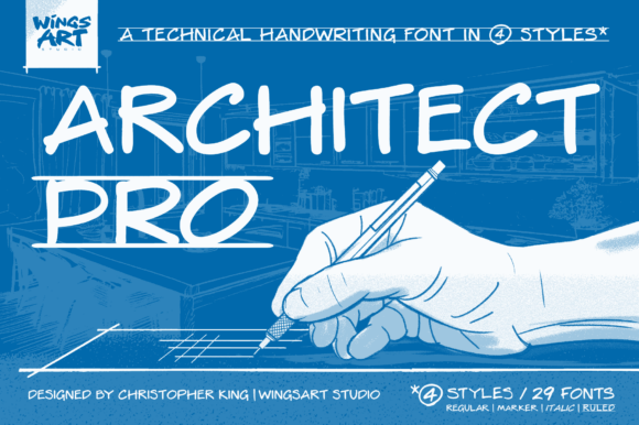
Architect Pro Font: A Clear, Legible Handwriting Font for Professional Architectural Design
The Architect Pro Font is a unique, handwriting font designed in the tradition of professional architectural design. This font style emerged from the need for clarity, precision, and consistency in architectural drawings. In this article, we’ll explore the history and evolution of architectural-style lettering, its characteristics, and the importance of the Architect Pro Font in modern design.
The Origins of Architectural-Style Lettering
Architectural-style lettering can be traced back to the early 20th century when the architectural drafting process required clear, easily legible text that could convey information in a small space. During this time, architectural drawings were done entirely by hand, and the ability to produce uniform, readable text quickly and consistently was essential.
The style of lettering used in architectural drawings was characterized by simplicity, clarity, and precision. Lettering needed to be simple enough to be legible at small sizes, yet stylized to maintain an authoritative and formal look. Its minimal characteristics made it possible to produce easily readable text without sacrificing speed.

The Importance of Consistency in Architectural Lettering
Using consistent, block-style text was essential for preventing errors on blueprints. In construction and engineering, misreading a single letter could lead to costly mistakes, so architects and engineers developed a style that could be read quickly and accurately by anyone, from the draftsman to the builder on-site.
This style of lettering evolved into an informal standard for architectural and technical drawings, taught in universities and reinforced through professional practice. The use of a standardized lettering style ensured that architectural drawings were not only aesthetically pleasing but also functional and easy to read.
The Characteristics of Architectural-Style Lettering
Architectural-style lettering is characterized by its simplicity, clarity, and precision. The letters are typically block-style, with clean lines and minimal ornamentation. The font style is designed to be highly legible, even at small sizes, making it ideal for use in architectural drawings and technical documents.
The Architect Pro Font is a modern digital font that aims to convey the personal, human touch of hand-lettering and its connection to the tradition of drafting by hand. The font offers the unbeatable precision, clarity, and consistency of a modern digital font, making it an essential tool for architects, engineers, and designers.

The Benefits of Using the Architect Pro Font
The Architect Pro Font offers a range of benefits for architects, engineers, and designers. The font is designed to be highly legible, even at small sizes, making it ideal for use in architectural drawings and technical documents.
- Improved Readability: The Architect Pro Font is designed to be highly legible, even at small sizes, reducing the risk of errors and misinterpretations.
- Increased Efficiency: The font’s clean and simple design makes it easy to read and write, saving time and increasing productivity.
- Enhanced Professionalism: The Architect Pro Font is a professional-grade font that conveys a sense of authority and expertise, making it ideal for use in architectural and technical documents.
The Future of Architectural Lettering
The Architect Pro Font is a modern digital font that is designed to meet the needs of architects, engineers, and designers in the 21st century. The font is a testament to the evolution of architectural lettering, from its origins in traditional drafting techniques to its modern digital applications.
As technology continues to advance, the importance of clear, legible lettering will remain essential in architectural and technical design. The Architect Pro Font is a valuable tool for anyone looking to create professional-grade architectural drawings and technical documents.
Architect Pro Font: Access Download Now
| Font Name | Architect Pro Font |
| Author | Unknown |
| Download | Access Download Here |
Conclusion
In conclusion, the Architect Pro Font is a unique, handwriting font designed in the tradition of professional architectural design. The font’s simplicity, clarity, and precision make it an essential tool for architects, engineers, and designers.
Whether you’re working on a large-scale architectural project or a small technical document, the Architect Pro Font is a valuable resource that can help you create professional-grade designs with ease.
