
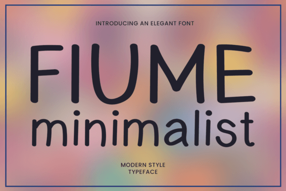
Introducing Fiume Minimalist: A Modern Typeface for the Digital Age
In the realm of typography, the quest for the perfect font is ongoing. With the digital landscape evolving at a rapid pace, designers and brands are constantly on the lookout for typefaces that can adapt, impress, and endure. It is in this context that Fiume Minimalist emerges, a modern typeface meticulously crafted for the demands of the digital age. With its unique blend of clean geometric shapes and subtle organic curves, Fiume Minimalist is poised to redefine the boundaries of digital typography.
The Genesis of Fiume Minimalist
Fiume Minimalist was born out of a desire to create a typeface that embodies the essence of modern design while being highly functional across various mediums. The design process involved a deep dive into the principles of minimalism, with a focus on simplicity, precision, and elegance. The result is a typeface that strikes a delicate balance between sophistication and approachability, making it an invaluable asset for designers and brands aiming to leave a lasting impression.
📸 Preview Images


💡 Click on any image to view full size
Design Characteristics
At the heart of Fiume Minimalist lies its distinctive design language, characterized by clean geometric shapes and subtle organic curves. This combination lends the typeface its unique elegance and versatility. The geometric foundation provides a sense of structure and order, while the organic curves add a touch of warmth and humanity. This blend ensures that Fiume Minimalist stands out in both display and body text applications, effortlessly adapting to the demands of branding, editorial design, and digital interfaces.
Clean Geometric Shapes
The clean geometric shapes of Fiume Minimalist are a testament to its modern aesthetic. These shapes contribute to the typeface’s clarity and legibility, making it exceptionally suited for digital platforms where screen resolution and size can vary greatly. The geometric precision also ensures that the typeface remains crisp and clear in print, showcasing its versatility across different mediums.
Subtle Organic Curves
The subtle organic curves woven into Fiume Minimalist’s design add a layer of sophistication and warmth. These curves soften the typeface’s overall appearance, preventing it from feeling too rigid or mechanical. The result is a typeface that feels both contemporary and approachable, capable of engaging audiences across a wide spectrum of design applications.
Versatility and Application
One of the standout features of Fiume Minimalist is its remarkable versatility. The typeface is designed to excel in both display and body text applications, making it an incredibly valuable tool for designers. Whether it’s used for headlines, subheadings, or extended blocks of text, Fiume Minimalist maintains its visual appeal and readability. This adaptability extends to various design fields, including branding, editorial design, digital interfaces, and more.
Branding
In branding, Fiume Minimalist can serve as a powerful visual element, helping to establish a company’s identity. Its clean lines and elegant curves convey a sense of professionalism and sophistication, making it ideal for logos, wordmarks, and marketing materials.
Editorial Design
For editorial design, Fiume Minimalist offers a refined and contemporary look, perfect for magazines, newspapers, and digital publications. Its legibility and aesthetic appeal ensure that content is presented in an engaging and accessible manner.
Digital Interfaces
In digital interfaces, Fiume Minimalist shines by providing an optimal reading experience across various devices and screen sizes. Its design takes into account the nuances of digital typography, ensuring that text remains clear and readable, even at smaller sizes.
Readability and Visual Harmony
Fiume Minimalist has been meticulously designed with readability and visual harmony in mind. Every glyph has been carefully crafted to ensure that the typeface performs exceptionally well across different mediums, from digital screens to print. The attention to detail in the design process guarantees that Fiume Minimalist maintains its elegance and legibility, whether used in large display settings or in smaller body text.
Optimal Readability
The optimal readability of Fiume Minimalist is a result of its carefully considered design elements, including letter spacing, x-height, and stroke width. These elements work in harmony to create a typeface that is easy on the eyes, reducing reader fatigue and enhancing the overall reading experience.
Visual Harmony
Visual harmony is achieved through the consistent application of Fiume Minimalist’s design principles across its character set. This consistency ensures that the typeface feels cohesive and aesthetically pleasing, making it a joy to read and look at.
Multiple Weights and Styles
Fiume Minimalist is designed to offer flexibility through its range of weights and styles. This versatility allows designers to use the typeface across a variety of applications, from headlines and titles to body text and captions. The availability of multiple weights and styles also enables the creation of visual hierarchies, enhancing the overall design and facilitating easier navigation through content.
Creative Freedom
The range of weights and styles in Fiume Minimalist invites creativity and experimentation. Designers can mix and match different weights and styles to create visually engaging compositions that capture the audience’s attention and convey the intended message effectively.
Timeless Aesthetic
Despite the ever-changing nature of design trends, Fiume Minimalist is crafted to maintain a timeless aesthetic. Its classic design elements, combined with modern touches, ensure that the typeface remains relevant and stylish for years to come, providing a solid foundation for designs that need to stand the test of time.
Fiume Minimalist Font: Access Download Now
| Font Name | Fiume Minimalist Font |
| Author | Unknown |
| Download | Access Download Here |
Conclusion
Fiume Minimalist represents a significant advancement in modern typography, offering a perfect blend of elegance, versatility, and functionality. Its design caters to the needs of the digital age, while its timeless aesthetic ensures enduring relevance. Whether for branding, editorial design, digital interfaces, or any other application, Fiume Minimalist is poised to become an indispensable tool in the world of design.
