
Introducing Hostile Font: The Ultimate Blackletter Typeface for Autumn Branding
The early autumn season is a time of transition, marked by the changing colors of the leaves, the crispness of the air, and the warmth of cozy sweaters. It’s also a season of creative possibilities, as brands and designers seek to capture the essence of this magical time of year in their marketing materials. One of the most effective ways to evoke the feeling of autumn is through typography, and that’s where the Hostile font comes in – a rich, vintage blackletter typeface that’s perfectly suited for branding, labels, and posters.

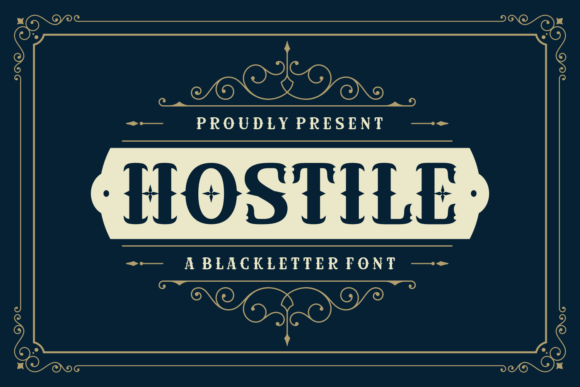
A promotional image for “Hostile,” a blackletter font.
📸 Preview Images


💡 Click on any image to view full size
The Story Behind Hostile Font
The Hostile font is a carefully crafted typeface that draws inspiration from traditional blackletter fonts, with a modern twist. Its unique design combines the elegance of classic calligraphy with the boldness of contemporary typography, making it an ideal choice for designers looking to create eye-catching and memorable branding materials. Whether you’re working on a logo, a poster, or a label, the Hostile font is sure to make a statement.
Key Features of Hostile Font
- Rich, vintage style: The Hostile font boasts a rich, vintage aesthetic that’s perfect for autumn branding. Its intricate details and ornate flourishes evoke the feeling of classic craftsmanship and tradition.
- Blackletter typeface: The Hostile font is a true blackletter typeface, with bold, dramatic strokes and sharp, angular lines. This makes it ideal for creating eye-catching headlines and titles.
- Perfect for branding and advertising: The Hostile font is designed to help brands stand out in a crowded marketplace. Its unique style and bold personality make it perfect for logos, labels, and posters.
- Highly versatile: The Hostile font is highly versatile, and can be used in a wide range of design applications, from digital marketing materials to print collateral.
Why Choose Hostile Font for Your Autumn Branding?
As the seasons change and autumn arrives, brands are looking for ways to refresh their marketing materials and connect with their audiences in a more meaningful way. The Hostile font offers a unique and compelling solution, with its rich, vintage style and bold, blackletter aesthetic. Here are just a few reasons why you should consider using the Hostile font for your autumn branding:
- Evokes the feeling of autumn: The Hostile font is perfectly suited for the early autumn season, with its warm, rich colors and bold, dramatic strokes.
- Creates a lasting impression: The Hostile font is designed to make a statement, with its bold personality and eye-catching style. This makes it perfect for creating memorable branding materials that will leave a lasting impression on your audience.
- Helps you stand out: In a crowded marketplace, it’s harder than ever to get noticed. The Hostile font offers a unique and compelling way to differentiate your brand and stand out from the competition.
How to Use Hostile Font in Your Design Projects
The Hostile font is a highly versatile typeface that can be used in a wide range of design applications. Here are just a few ideas to get you started:
- Logos and branding materials: The Hostile font is perfect for creating eye-catching logos and branding materials that will help your business stand out.
- Posters and flyers: The Hostile font is ideal for creating bold, attention-grabbing posters and flyers that will grab your audience’s attention.
- Labels and packaging: The Hostile font is a great choice for labels and packaging, adding a touch of elegance and sophistication to your products.
Tips for Getting the Most Out of Hostile Font
To get the most out of the Hostile font, here are a few tips to keep in mind:
- Use it boldly: The Hostile font is designed to make a statement, so don’t be afraid to use it boldly. Experiment with different sizes, colors, and styles to create eye-catching headlines and titles.
- Pair it with contrasting fonts: To create visual interest and add depth to your design, try pairing the Hostile font with contrasting fonts. This will help to create a sense of hierarchy and guide the viewer’s eye through your design.
- Experiment with colors: The Hostile font looks great in a wide range of colors, from rich, autumnal hues to bold, bright colors. Experiment with different colors to find the perfect look for your design.
Hostile Font: Access Download Now
| Font Name | Hostile Font |
| Author | Unknown |
| Download | Access Download Here |
Conclusion
The Hostile font is a powerful and versatile typeface that’s perfectly suited for autumn branding. Its rich, vintage style and bold, blackletter aesthetic make it ideal for creating eye-catching logos, labels, and posters that will leave a lasting impression on your audience. Whether you’re a designer, a brand owner, or simply someone who appreciates great typography, the Hostile font is definitely worth checking out.
