
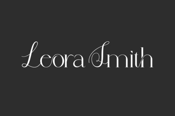
Introducing Leora Smith Font: The Epitome of Classy Serif Typography
In the realm of typography, few fonts manage to strike a balance between classic elegance and modern flair. Leora Smith Font is one such typeface that has garnered attention for its refined features and versatility. This article aims to provide an in-depth exploration of Leora Smith Font, highlighting its characteristics, uses, and the unique value it brings to design projects.
What is Leora Smith Font?
Leora Smith is a classy serif font that exudes sophistication and style. Its design is characterized by thin strokes, graceful curves, and stylish ligatures, making it an excellent choice for a variety of applications, from branding and magazine titles to logos and personal monograms.
📸 Preview Images


💡 Click on any image to view full size
The font’s aesthetic is rooted in traditional serif typography but is infused with a fashionable edge that sets it apart from more conventional typefaces. This blend of classic letterforms and elegant flourishes gives Leora Smith a luxurious, editorial feel that is highly sought after in modern design.
Key Features of Leora Smith Font
- Thin Strokes: The font features delicate strokes that contribute to its elegant appearance, making it suitable for designs that require a touch of sophistication.
- Graceful Curves: The curves in Leora Smith are meticulously crafted to enhance the font’s readability and aesthetic appeal, adding a soft, refined quality to the text.
- Stylish Ligatures: Ligatures in typography refer to the connection between two or more letters that, when combined, create a unique glyph. Leora Smith includes stylish ligatures that add an extra layer of elegance to the text, making it perfect for high-end branding and editorial content.
- Luxurious Editorial Feel: The combination of classic serif elements and modern flourishes gives Leora Smith a distinctive, high-end feel. This makes it an excellent choice for magazine titles, editorial pieces, and any project that demands a sophisticated look.
Best Use Cases for Leora Smith Font
Leora Smith’s versatility and elegant design make it suitable for a wide range of applications. Here are some of the best use cases for this classy serif font:
- Branding: For businesses aiming to establish a luxury brand image, Leora Smith can be a valuable asset. Its sophisticated look works well in logos, business cards, and packaging, helping to create a cohesive and upscale brand identity.
- Magazine Titles: The font’s elegant and commanding presence makes it an excellent choice for magazine titles, especially those focused on fashion, lifestyle, and culture.
- Logos: A well-designed logo is crucial for any business. Leora Smith’s unique blend of classic and modern elements can help create a memorable and impactful logo that stands out in the market.
- Personal Monograms: For personal projects or monograms, Leora Smith offers a touch of elegance and sophistication. It can be used to create beautiful, custom monograms for personal branding or gift designs.
Leora Smith vs. Other Serif Fonts
The world of serif fonts is vast, with numerous typefaces vying for attention. So, what sets Leora Smith apart from other serif fonts?
Compared to more traditional serif fonts like Times New Roman or Garamond, Leora Smith offers a more contemporary look with its thin strokes and stylish ligatures. It strikes a balance between being classic and approachable, yet sophisticated and luxurious.
When compared to more modern serif fonts like Playfair Display or Bodoni, Leora Smith holds its own with its unique blend of elegance and readability. It is less ornate than some of these fonts, making it more versatile for a variety of design applications.
Tips for Using Leora Smith Font Effectively
To make the most of Leora Smith Font in your designs, consider the following tips:
- Pair it with Sans-Serif Fonts: For body text, consider pairing Leora Smith with a clean sans-serif font to create contrast and enhance readability.
- Experiment with Ligatures: Take advantage of the stylish ligatures in Leora Smith to add a unique touch to your text. Ligatures can make a significant difference in the overall aesthetic of your design.
- Adjust Line Spacing: Given its elegant and somewhat delicate design, ensure that you adjust the line spacing appropriately to improve readability and flow.
- Consider Font Size: Leora Smith is best used at larger font sizes where its details can shine, especially for headings and titles. For body text, consider a more standard font size to maintain readability.
Leora Smith Font: Access Download Now
| Font Name | Leora Smith Font |
| Author | Unknown |
| Download | Access Download Here |
Conclusion
Leora Smith Font stands out in the world of typography for its classy, sophisticated design and versatile application. Its blend of traditional serif elements with a modern, fashionable edge makes it a valuable asset for designers looking to add a touch of elegance to their projects.
Whether you’re working on branding, magazine titles, logos, or personal monograms, Leora Smith offers the perfect combination of luxury and readability. By understanding its key features and best use cases, designers can leverage this beautiful font to create stunning, high-end designs that leave a lasting impression.
