
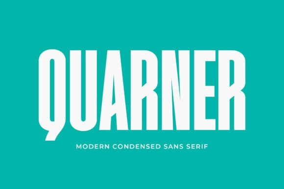
Quarner Font: The Ultimate Sans Serif for Modern Design
When it comes to selecting the perfect font for a design project, the choices can be overwhelming. However, if you’re looking for a modern, neat, and versatile sans serif font that excels in clarity, look no further than Quarner. Designed with clean lines and balanced proportions, Quarner is an exceptional typeface that can elevate any project, whether it’s for branding, web design, or editorial use.
The Design Philosophy Behind Quarner
Quarner’s design is rooted in the principles of modern typography, where simplicity and legibility are paramount. The font’s creator aimed to produce a typeface that would not only be aesthetically pleasing but also highly functional across various mediums. The result is a sleek, minimalist aesthetic that brings a fresh, professional feel to any project.
📸 Preview Images


💡 Click on any image to view full size

Key Features of Quarner Font
- Clean Lines: Quarner’s design is characterized by its clean, uncluttered lines, making it perfect for projects that require a crisp and modern look.
- Balanced Proportions: The font’s balanced proportions ensure that it remains legible at various sizes, from large headings to smaller body text.
- Sans Serif: As a sans serif font, Quarner offers a contemporary look that is versatile enough to be used in a wide range of design applications.
- Versatility: Quarner’s design allows it to be used for branding, web design, editorial content, and more, making it a valuable addition to any designer’s toolkit.
Applications of Quarner Font
Quarner’s versatility is one of its most compelling features. Here are some of the key areas where Quarner can make a significant impact:
Branding
In the world of branding, a font can play a crucial role in defining a company’s identity. Quarner, with its modern and professional aesthetic, is ideal for logos, marketing materials, and corporate communications. Its clean lines and balanced proportions ensure that the brand message is conveyed clearly and effectively.
Web Design
For web design, Quarner offers excellent readability and a fresh look that can enhance user experience. Its sans serif design ensures that it remains clear on digital screens, making it suitable for website headings, body text, and interface elements.
Editorial Use
In editorial design, such as in magazines, newspapers, and books, Quarner’s legibility and aesthetic appeal make it an excellent choice. It can be used for article titles, subtitles, and body text, providing a cohesive and professional look.
Benefits of Using Quarner Font
Choosing Quarner for your design projects comes with several benefits:
- Enhanced Readability: Quarner’s design prioritizes readability, ensuring that your content is easily accessible to readers.
- Professional Aesthetic: The font’s modern and clean design gives any project a professional edge, making it suitable for high-end clients and applications.
- Versatility: Quarner can be used across various platforms and design materials, providing flexibility and consistency in your design work.
- Easy to Pair: Due to its neutral design, Quarner can be easily paired with other fonts, allowing for a wide range of design possibilities.
How to Use Quarner Font Effectively
To get the most out of Quarner, consider the following tips:
Pairing with Other Fonts
While Quarner is versatile on its own, pairing it with complementary fonts can enhance its appeal. Choose fonts that contrast with Quarner’s clean and modern look to create visual interest. Serif fonts, script fonts, or other sans serifs with distinct characteristics can create a harmonious and engaging design.
Selecting the Right Weights
Quarner comes in various weights, allowing for a range of design options. Use the lighter weights for body text and headings where a subtle look is desired, and the heavier weights for titles and emphasis.
Adjusting Letter Spacing
Adjusting the letter spacing (tracking) can further enhance Quarner’s readability and aesthetic. For headings, slightly increased letter spacing can give a more open and airy feel, while for body text, standard or slightly reduced spacing ensures compactness and ease of reading.
Quarner Font: Access Download Now
| Font Name | Quarner Font |
| Author | Unknown |
| Download | Access Download Here |
Conclusion
Quarner font represents a significant advancement in sans serif typography, offering a blend of modernity, clarity, and versatility. Its clean lines, balanced proportions, and sleek aesthetic make it an excellent choice for a wide range of design applications, from branding and web design to editorial content. By incorporating Quarner into your projects, you can achieve a professional and fresh look that resonates with audiences and elevates your design work.
