
Introducing Quentin Font: The Sweet and Friendly Sans Serif for Your Designs
In the world of typography, fonts play a crucial role in conveying the tone and personality of a design. With thousands of fonts available, finding the perfect one that suits your project’s needs can be overwhelming. However, if you’re looking for a sweet and friendly sans serif font that can elevate your designs, look no further than Quentin Font. In this article, we’ll explore the unique features of Quentin Font, its versatility, and why it’s an excellent choice for a wide range of design projects.
What is Quentin Font?
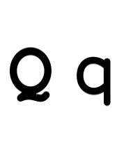
Quentin is a sweet and friendly sans serif font that boasts a natural and unique style. Its clean lines, rounded edges, and balanced proportions make it an approachable and inviting font. The font’s design is carefully crafted to evoke a sense of warmth and friendliness, making it perfect for designs that require a personal touch.
📸 Preview Images


💡 Click on any image to view full size

Key Features of Quentin Font
- Sans Serif: Quentin Font is a sans serif font, which means it doesn’t have serifs or small lines at the end of the letters. This makes it a great choice for digital designs, as it remains clear and legible even at small sizes.
- Unique Style: Quentin Font has a distinct style that sets it apart from other sans serif fonts. Its rounded edges and balanced proportions give it a friendly and approachable feel.
- Natural Look: The font’s natural look makes it suitable for a wide range of designs, from playful and creative projects to more formal and professional ones.
- Versatile: Quentin Font is incredibly versatile, making it perfect for various design applications, including logos, headings, body text, and more.
Design Applications for Quentin Font
Quentin Font’s versatility makes it an excellent choice for a wide range of design projects. Here are some design applications where Quentin Font shines:
- Logos and Branding: Quentin Font’s unique style and friendly feel make it an excellent choice for logos and branding projects. Its clean lines and rounded edges create a memorable and approachable visual identity.
- Headings and Titles: The font’s bold and balanced proportions make it perfect for headings and titles. It’s an excellent choice for creating attention-grabbing headlines that convey a sense of friendliness and approachability.
- Body Text: Quentin Font’s legibility and natural look make it suitable for body text. Its clean lines and balanced proportions ensure that your content is easy to read and understand.
- Packaging Design: The font’s playful and creative feel makes it an excellent choice for packaging design. It’s perfect for creating eye-catching labels and packaging that stands out on store shelves.
- Digital Designs: Quentin Font’s sans serif design and clean lines make it a great choice for digital designs, including websites, mobile apps, and social media graphics.
Benefits of Using Quentin Font
Quentin Font offers several benefits that make it an attractive choice for designers. Here are some of the advantages of using Quentin Font:
- Unique Style: Quentin Font’s unique style sets it apart from other sans serif fonts. Its rounded edges and balanced proportions give it a friendly and approachable feel that can’t be replicated by other fonts.
- Versatility: The font’s versatility makes it perfect for a wide range of design projects. Its clean lines and natural look ensure that it fits seamlessly into various design applications.
- Legibility: Quentin Font’s clean lines and balanced proportions ensure that it’s highly legible, even at small sizes. This makes it perfect for body text and other applications where readability is crucial.
- Easy to Pair: Quentin Font is easy to pair with other fonts, making it a great choice for designs that require multiple font styles.
Tips and Tricks for Using Quentin Font
Here are some tips and tricks for getting the most out of Quentin Font:
- Use it with a contrasting font: Quentin Font pairs well with fonts that have a contrasting style. Try pairing it with a serif font or a script font to create visual interest.
- Experiment with font sizes: Quentin Font’s clean lines and balanced proportions make it suitable for a wide range of font sizes. Experiment with different font sizes to find the perfect balance for your design.
- Pay attention to line spacing: Make sure to adjust the line spacing to ensure that your text is easy to read. A good rule of thumb is to set the line spacing to 1.2 or 1.5 times the font size.
- Use it for body text: Quentin Font’s legibility and natural look make it suitable for body text. Use it for paragraphs and other blocks of text to create a clean and readable design.
Quentin Font: Access Download Now
| Font Name | Quentin Font |
| Author | Unknown |
| Download | Access Download Here |
Conclusion
In conclusion, Quentin Font is a sweet and friendly sans serif font that’s perfect for a wide range of design projects. Its unique style, versatility, and legibility make it an excellent choice for logos, headings, body text, and more. With its clean lines and natural look, Quentin Font is sure to elevate your designs and convey a sense of friendliness and approachability. So why not give Quentin Font a try and see how it can enhance your designs?
