
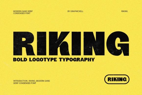
Riking Font: The Epitome of Modern Simplicity and Sophistication
In the realm of typography, fonts play a pivotal role in conveying messages, evoking emotions, and creating lasting impressions. Among the myriad of typefaces available, Riking font stands out as a sleek and contemporary condensed sans-serif typeface that embodies modern simplicity and sophistication. With its clean lines and compact design, Riking is the perfect choice for projects that demand a minimalist and stylish aesthetic.
The Design Philosophy of Riking Font
Riking font is a masterclass in minimalist design. Its creation was driven by the need for a typeface that could deliver a sharp and professional look without compromising on style or legibility. The designers of Riking achieved this by focusing on clean lines, simple shapes, and a highly legible structure. The result is a font that exudes confidence, modernity, and a keen sense of sophistication.
📸 Preview Images


💡 Click on any image to view full size
Key Features of Riking Font
- Condensed Sans-Serif Design: Riking’s condensed design makes it ideal for use in tight spaces, such as in headlines, logos, and digital interfaces, where space is limited but impact is crucial.
- Clean Lines and Simple Shapes: The font’s clean lines and simple shapes contribute to its modern and minimalist aesthetic, making it versatile for a wide range of applications.
- High Legibility: Despite its condensed nature, Riking maintains high legibility, ensuring that messages are conveyed clearly and effectively.
- Professional and Sophisticated: Riking’s design strikes a perfect balance between professionalism and sophistication, making it suitable for projects that require a touch of elegance and refinement.
Applications of Riking Font
Riking font’s versatility and stylish aesthetic make it an excellent choice for a variety of design projects. Here are some of the key areas where Riking truly shines:
Logo Design
In logo design, first impressions matter. Riking’s bold and condensed structure allows for the creation of impactful and memorable logos that stand out. Its simplicity ensures that the logo remains versatile and can be used across different mediums, from business cards to billboards.
Headlines and Titles
Riking font is perfect for headlines and titles, where making a statement is key. Its clean and modern look draws attention without overwhelming the content. Whether it’s for a magazine, a website, or an advertising campaign, Riking headlines are sure to leave an impact.
Digital Interfaces
In the digital realm, typography plays a crucial role in user experience. Riking’s legibility and professional aesthetic make it an excellent choice for digital interfaces, including websites, mobile apps, and software. It helps create a seamless and engaging user experience, enhancing the overall usability of digital products.
Print Materials
Riking font is not limited to digital use; it also excels in print. Its crisp and clean design makes it suitable for brochures, posters, flyers, and any other print materials where a modern and sophisticated look is desired.
Why Choose Riking Font?
With so many fonts available, why should you choose Riking for your projects? Here are some compelling reasons:
Uniqueness and Versatility
Riking offers a unique blend of modern simplicity and sophistication, making it stand out in a sea of generic fonts. Its versatility allows it to be used in a wide range of applications, from digital to print, and across various industries.
Legibility and Readability
Despite its condensed design, Riking does not compromise on legibility. It ensures that your messages are communicated clearly and effectively, making it an excellent choice for both headlines and body text.
Professionalism
Riking’s sleek and clean design exudes professionalism, making it perfect for projects that demand a high level of sophistication and refinement. Whether it’s for a corporate brand or a creative venture, Riking helps create a polished and professional image.
Easy to Pair
Riking can be easily paired with other fonts to create a cohesive and harmonious design. Its neutral background makes it versatile and easy to combine with a variety of typefaces, ensuring a balanced and aesthetically pleasing layout.
How to Use Riking Font Effectively
To make the most out of Riking font, consider the following tips:
Pair with Complementary Fonts
While Riking is versatile on its own, pairing it with complementary fonts can enhance its appeal. Choose fonts that contrast with Riking’s clean and modern look to create visual interest and hierarchy in your design.
Adjust Font Weights
Riking comes in various weights, which can be used to create hierarchy and emphasis in your design. Use bold weights for headlines and lighter weights for body text to maintain readability and visual balance.
Consider Color and Spacing
Color and spacing play a crucial role in typography. Choose colors that complement your brand and ensure adequate spacing between lines and letters to enhance legibility and overall aesthetic appeal.
Riking Font: Access Download Now
| Font Name | Riking Font |
| Author | Unknown |
| Download | Access Download Here |
Conclusion
Riking font is a powerful tool for designers looking to create modern, sophisticated, and impactful designs. Its sleek and condensed sans-serif design, combined with high legibility and versatility, makes it an excellent choice for a wide range of applications. By incorporating Riking into your typography arsenal, you can elevate your designs and create a lasting impression on your audience. Whether you’re designing logos, headlines, or digital interfaces, Riking font delivers a sharp and professional look that makes a bold statement.
