
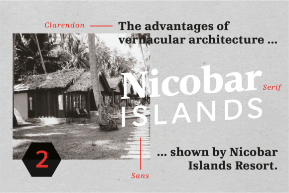
Vernacular Serif Font: A Comprehensive Guide to the Elegant Typeface
The Vernacular trilogy is a remarkable collection of typefaces designed by Swiss designer Hans-Jürg Hunziker. With a background in working for Adrian Frutiger in Paris, Hunziker brought his expertise to create a stunning bouquet of typefaces that cater to various design needs. The Vernacular trilogy consists of a Sans family, a Serif family, and a Clarendon family, each with 12 font weights and including separately drawn italics. In this article, we’ll delve into the world of Vernacular Serif Font and explore its features, design concept, and applications.
The Design Concept: A Transitional Linear Antiqua
Hans-Jürg Hunziker’s design concept for Vernacular is rooted in the traditional Linear Antiqua style, with a twist. He aimed to create a typeface that embodies the essence of transitional typography, while infusing it with a modern and noble expression. The Vernacular Serif Font, in particular, boasts a classic design with a subtle elegance, making it suitable for book design, corporate identity, and various print and digital applications.
📸 Preview Images


💡 Click on any image to view full size
The Vernacular trilogy shares a common feature – the straight stems and proportions – which stress the closeness of the typeface family. However, each font style has its unique character. The Serif font features a traditional diagonal axis and horizontal endings, whereas the Sans and Clarendon fonts have a vertical axis and similar endings. This harmonious balance allows the fonts to work well together and complement each other perfectly.
Key Features of Vernacular Serif Font
The Vernacular Serif Font offers a range of features that make it an excellent choice for designers:
- 12 font weights: The Serif font comes in 12 finely tuned font weights, allowing for precise typography and flexibility.
- Italic styles: Each font weight includes a separately drawn italic style, providing a comprehensive range of typographic options.
- Tabular and proportional figures: The font includes both tabular and proportional figures, as well as old-style figures, catering to various design requirements.
- Small caps and small cap figures: Vernacular Serif Font offers small caps and small cap figures, adding to its versatility.
- Alternative characters: Some fonts feature alternative characters, such as the «g», which can be accessed via style set, allowing for further typographic variation.
These features make Vernacular Serif Font an excellent choice for book design, corporate identity, and various print and digital applications.
The Benefits of Using Vernacular Serif Font
The Vernacular Serif Font offers several benefits to designers and typographers:
- Elegant and noble expression: The font’s design embodies a noble and sympathetic expression, making it suitable for high-end designs.
- Flexibility: With 12 font weights, italic styles, and various typographic features, Vernacular Serif Font provides a high degree of flexibility.
- Cohesive typography: The Vernacular trilogy’s shared design concept and features ensure cohesive typography across different font styles.
- Well-kept typesetting: The font’s features, such as tabular and proportional figures, make it ideal for well-kept typesetting in print and digital media.
Whether you’re working on a book design, corporate identity, or digital project, Vernacular Serif Font offers the perfect combination of elegance, flexibility, and cohesion.
Applications of Vernacular Serif Font
The Vernacular Serif Font is suitable for a wide range of applications:
- Book design: The font’s classic design and elegant expression make it perfect for book design, particularly for fiction, non-fiction, and academic publications.
- Corporate identity: Vernacular Serif Font can be used in corporate identity designs, such as logos, letterheads, and business cards, to convey a sense of professionalism and elegance.
- Print media: The font is suitable for various print media, including magazines, newspapers, and brochures.
- Digital media: Vernacular Serif Font can be used in digital media, such as e-books, websites, and digital publications.
The font’s versatility and range of features make it an excellent choice for designers working on various projects.
Vernacular Serif Font: Access Download Now
| Font Name | Vernacular Serif Font |
| Author | Unknown |
| Download | Access Download Here |
Conclusion
In conclusion, the Vernacular Serif Font is a remarkable typeface that offers a unique combination of elegance, flexibility, and cohesion. Designed by Hans-Jürg Hunziker, the font is part of the Vernacular trilogy, which includes a Sans family, a Serif family, and a Clarendon family. With its 12 font weights, italic styles, and various typographic features, Vernacular Serif Font is suitable for a wide range of applications, from book design and corporate identity to print and digital media.
Whether you’re a designer, typographer, or simply a typography enthusiast, Vernacular Serif Font is definitely worth exploring. Its noble and sympathetic expression, combined with its flexibility and range of features, make it an excellent choice for anyone looking to elevate their typography.
